
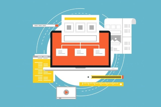
Are you wondering what makes an effective web design?
Is it the visual elements, or is it the functionality?
Truth be told it is a combination of both. As Steve Jobs once said, “Design is not just what it looks like and feels like. Design is how it works.”
Websites with great usability and function tend to perform better on Google than those just with beautiful design. We want to show you 10 ways to improve your existing website to ensure you are getting the most bang for your buck.
Check out these nine tips to improve your web design.
Purpose and Function
An exceptional website has a clear purpose, and the function is evident and intuitive. The design of every element and how they come together as a whole should be derived from the purpose and function of the website.
Communication and Interaction
Internet users want information quickly. To ensure you are providing lightning-fast information, you should be clear and concise, using headlines, and subtitles to provide valuable information. Links to the email address or contact form, live chat, and feedback form should also be easily accessible.
Intuitive Navigation
Navigation is a core element in which your website is built upon. The navigation should make sense to your visitors whatever path they wish to take. Navigating from point A to C based on the customer’s journey should flow smoothly without any barriers or friction. Ensure your customers can find the information they are looking for within 3 clicks or less.
Design Consistency
Each design element should match throughout the entire website. This means your headlines, colors, and so forth should all have the same look and feel. Take the time to plan out every detail to ensure your message is consistent throughout.
F-Pattern design & Grid-Based Layout
Ensure your page elements are arranged in a way that is natural for the eye. Studies have shown that people view pages in an “F” shaped pattern. Arrange your content based on a grid to create content that is both aligned and balanced.
Typography and Readability
The text is one of the most vital elements to a website, providing users with necessary information, and providing content for SEO. Create visually engaging type by using attractive and readable typefaces.
Color palette and imagery
Use a well thought out color pallet to enhance your user’s experience. Use contrasting colors for the background and text, while implementing vibrant colors for buttons and headlines to draw the user’s attention.
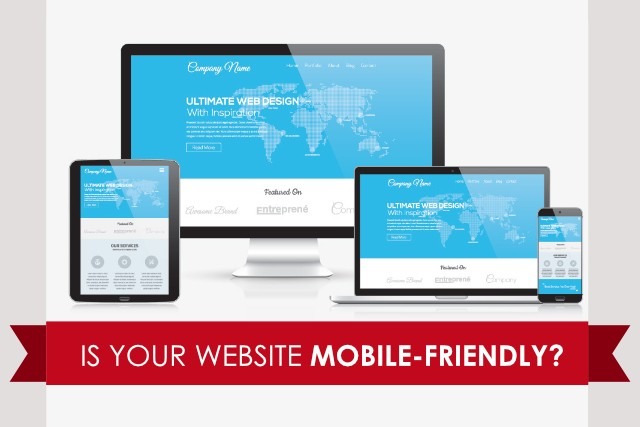
Mobile-friendliness
The number of devices that users are viewing websites from has increased dramatically over the past few years. Ensure your website is built with a responsive layout.
Loading speed
Take the time to ensure your website is loading at lightning speed. User’s hate when it takes more than just a few seconds to load a page.
Are you ready to grow your business now? If you’re ready to take the next step and make your business more profitable, please reach out to us.
If you like the information you are receiving, please share this post.


