
It’s one thing to create a landing page; it’s another thing to build a landing page that converts!
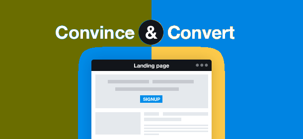
We are all familiar with the landing page. You know, that page that is intended to entice us to sign up for something or to purchase a product or service. Well, we also know that there are as many designs of landing pages as there are products and services to sell.
There has been a lot of research and trial and error done in the name of developing landing pages. And, weirdly enough, some of those landing pages that seem to go on endlessly actually have a good conversion rate. Now, I say weirdly enough because, quite frankly, I don’t enjoy scrolling down the page forever to try to find the features and benefits of a product or service that I’m interested in. Yet, it has been shown that many of these types of pages are actually very successful.
Design and content are critical when developing your landing page. It must be attractive enough to draw in users, and phrased simply enough that prospects can easily understand what is being offered. If your landing pages cluttered or does not have clear CTAs (call to action), the likelihood of obtaining conversions is pretty slim.
From a functional perspective, it’s imperative that you ensure that the backend is properly structured as well. Test to make sure that your contact form is functioning properly, linking to the appropriate thank you pages and or leading to any upsells that you may have.
In order to build landing pages that are more likely to convert, consider the following six points:
- Is your offering presented in a way that your target user can easily understand? As mentioned above, ensuring that your offering is clear and that the details are simply presented will greatly improve the likelihood that the user will convert.
- Does the landing page meet your prospects’ expectations? There is nothing worse than a landing page that does not clearly define the product or service that is being presented. Can your prospects find the information at their looking for? Are there questions appropriately anticipated and answered? Don’t frustrate your users by giving them incomplete information.
- Can your prospects easily sign up for your offering using the forms you’ve provided? Again, as mentioned above, be sure to test your landing page forms. Make sure that they are directing your users to the appropriate pages.
- Can your users be distracted by anything on the page? The key here is to provide information in an easy to read, yet entertaining fashion, without diverting the user’s attention from your key goal of getting them to buy in.
- Will it your users think that your offer has enough value that they are willing to pay money and enter their contact information for it? There are literally millions of online offers these days. To ensure that you are going to get people to opt in or purchase your product, make sure that it is presented in a way that assures them that they will be getting good value for their money.
- Have you provided enough information to your users prior to the CTA? Let’s face it; no one is going to click on your CTA if their questions or concerns have not been addressed. Be sure to review your landing page through the eyes of your prospects, anticipating any concerns or questions that they may have before they click on that call-to-action button.
Until next time…
Are you ready to grow your business now? If you’re ready to take the next step and make your business more profitable, contact us today.
If you like the information you are receiving, please consider forwarding this post.